
Since its introduction, Apple's new Liquid Glass design in upcoming software updates has been hotly debated. The biggest complaint concerns the readability of menus under the new aesthetic.
The Problem With Liquid Glass
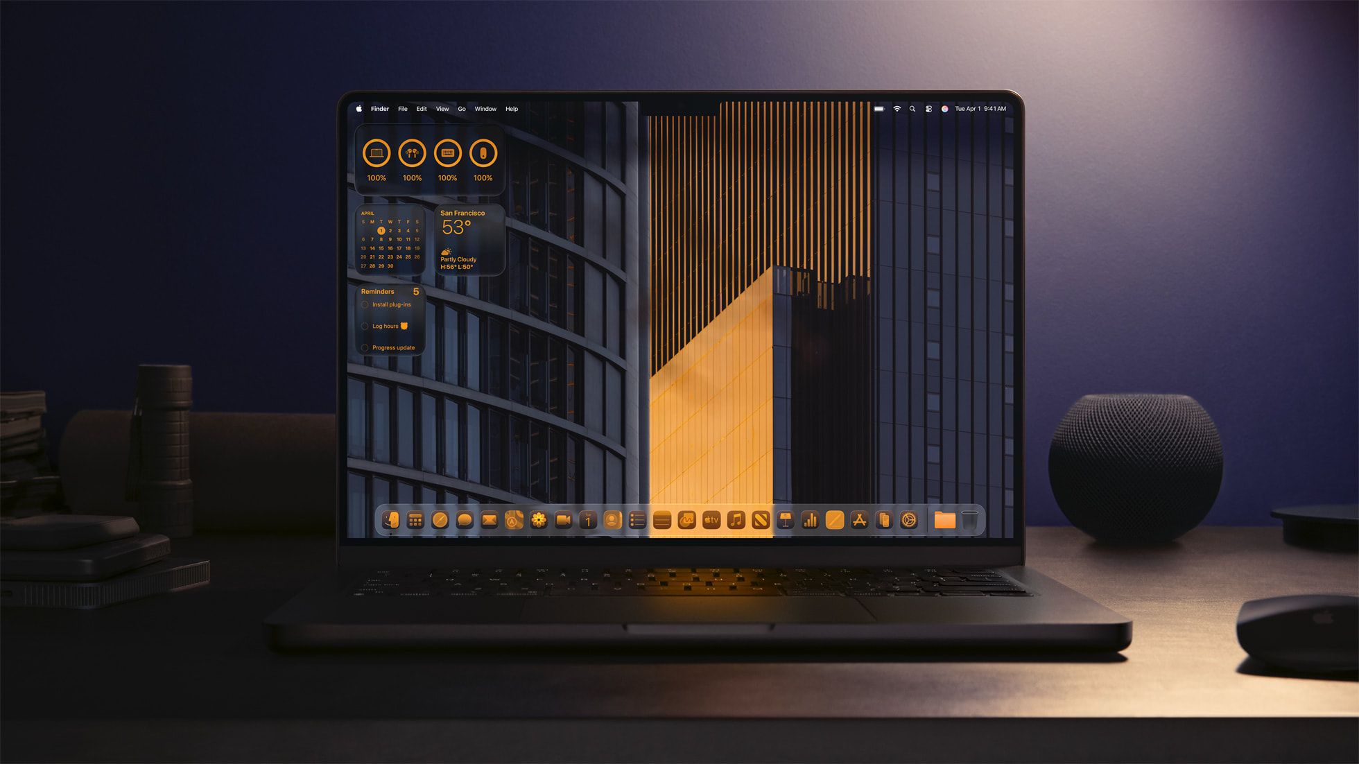
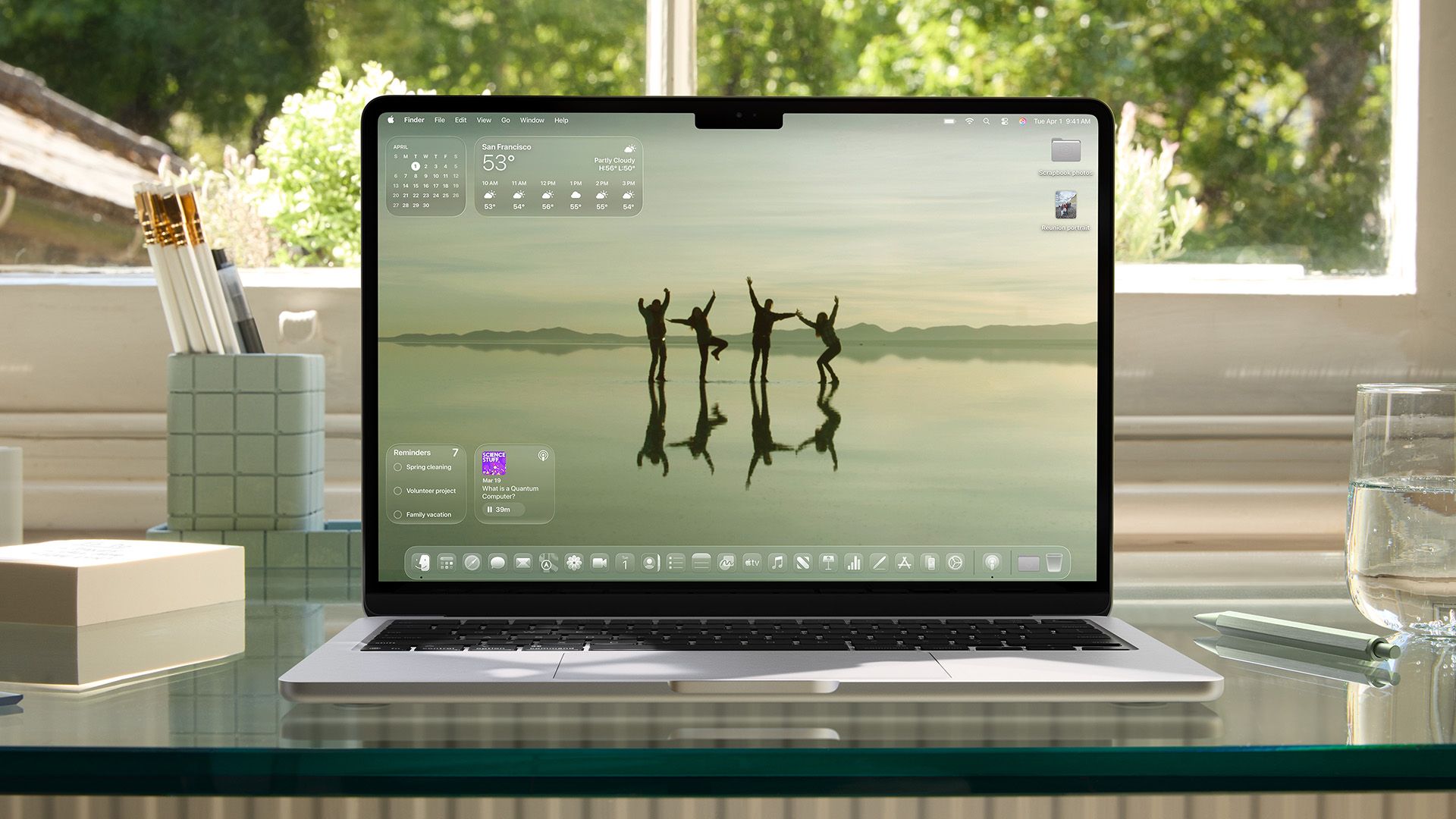
Liquid Glass is Apple’s newest user-experience design, and it will be included in all of its operating systems, including iOS, iPadOS, macOS, watchOS, and tvOS.
The last major overhaul of Apple's operating systems was the introduction of iOS 7 in 2013. Since then, the design language has been implemented across the company's entire ecosystem and has been the foundation for many future updates.
Your Mac Is Getting 'Liquid Glass', Spotlight Upgrades, and More
The macOS Tahoe 26 update is coming later this year.
With its 26-branded updates coming in the fall of 2025, Apple is ushering in a new era for its ecosystem as a whole. The company is looking to unify each operating system so that the look, feel, and experience will remain familiar no matter which device you use.
The foundation of this new era is what Apple calls “Liquid Glass,” which brings the user experience the optical qualities of glass and a sense of fluidity. Think of it like placing a sheet of glass over a piece of paper—that’s the effect it aims to portray.
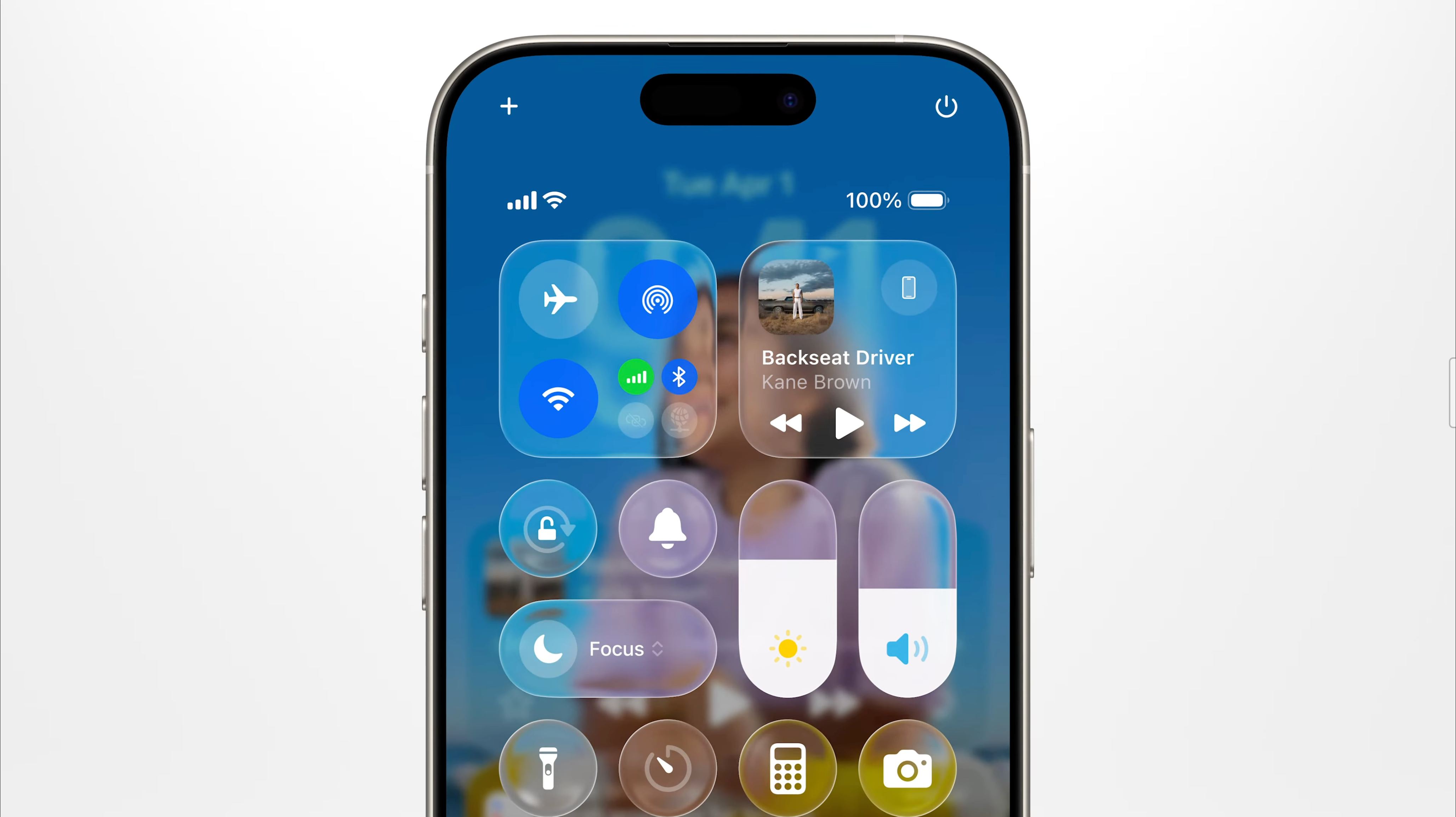
However, the design has received mixed reactions from the public regarding its readability and how text appears when overlaid on a menu background. Many have complained that the text in notifications and menus is difficult to read and decipher.
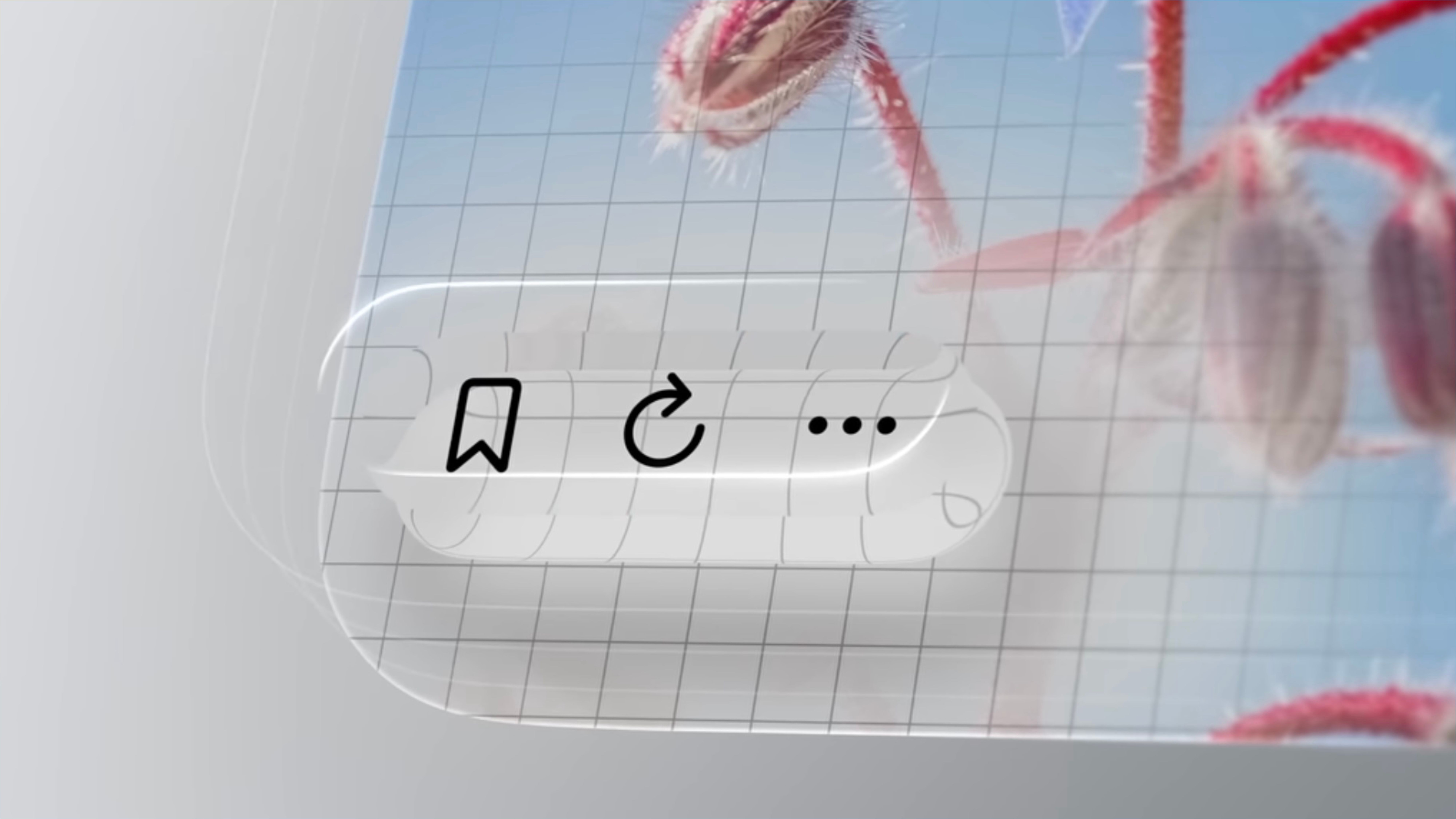
To amend this, Apple has been fine-tuning Liquid Glass in its previous betas. This has included further blurring the background of the menu bar and notifications to make text more readable.
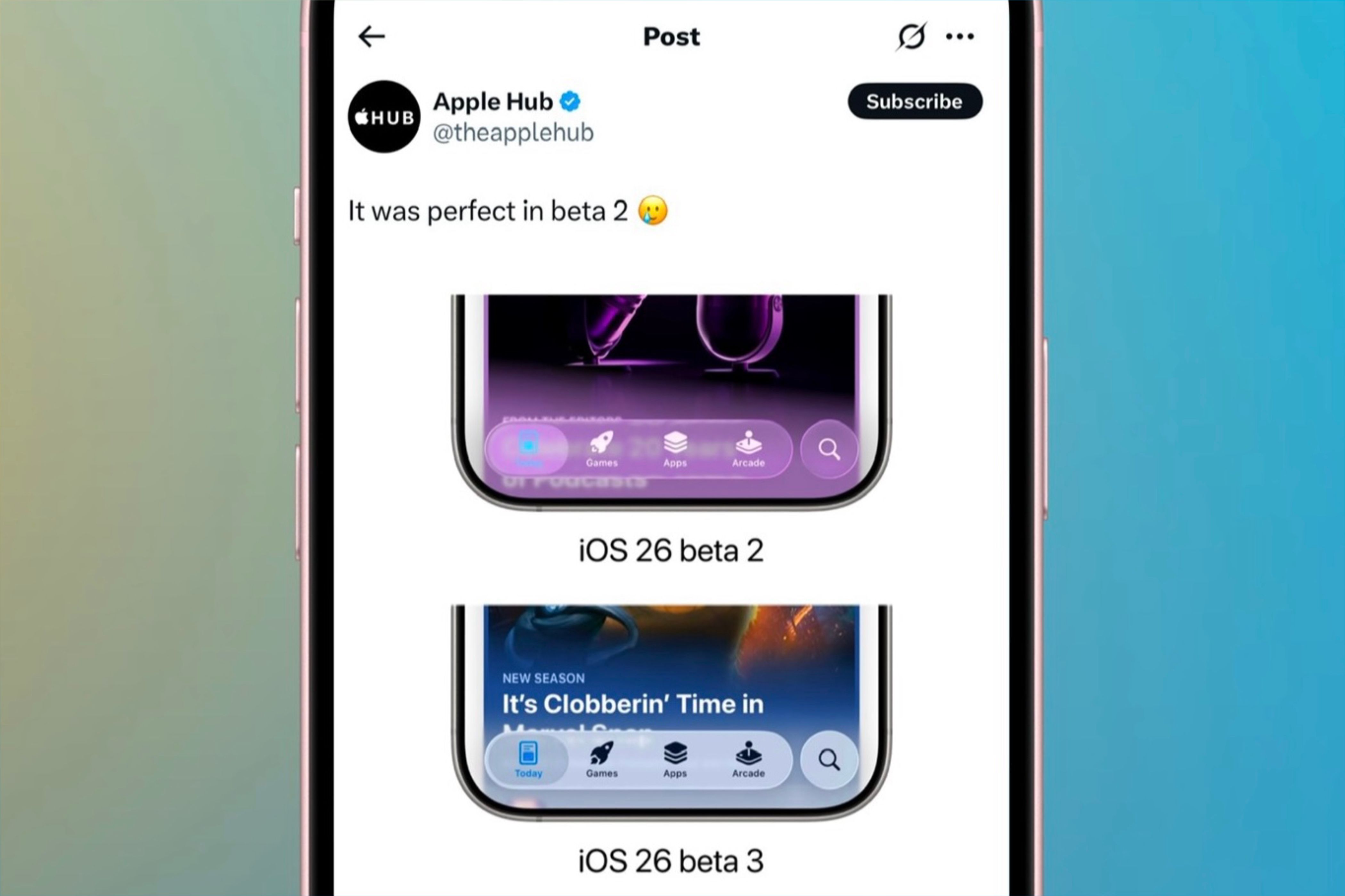
Yet, when beta three came around, Apple seemed to turn the blur effect to the highest level. This has made many people refer to Liquid Glass as “Frosted Glass” due to its more frosted appearance.
While the text is legible, the new design seems to stray from the original vision. But while Apple is continuously fine-tuning the look, I believe there’s another route they should take to solve the issue with Liquid Glass’s appearance.
It’s Time to Add a Liquid Glass Slider
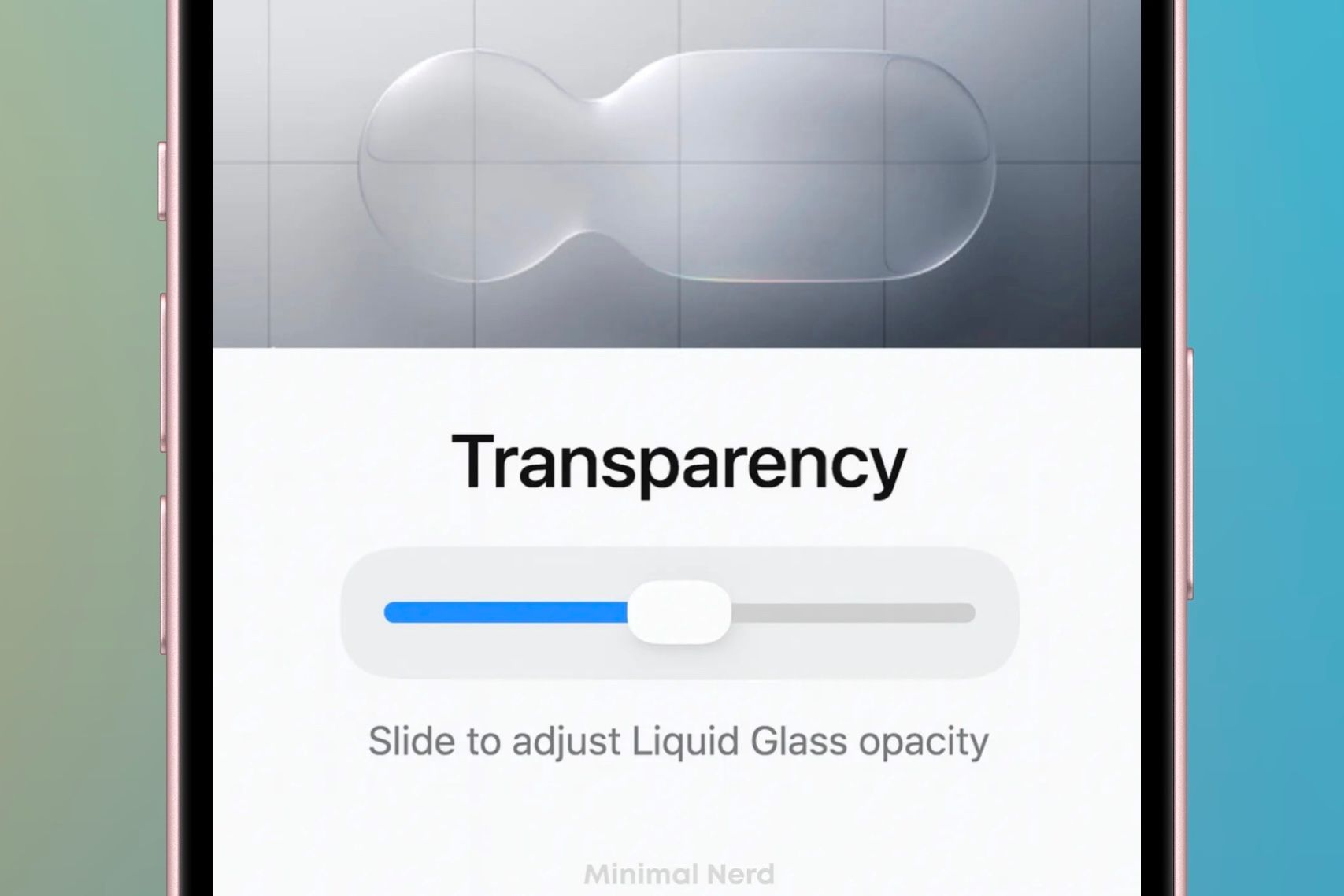
No matter how Liquid Glass looks in the final version of the new updates, not everyone will like it. This is where a slider or at least different intensity options would work best.
A slider that allows you to determine the intensity of the Liquid Glass effect would allow everyone to select what they like. This would resemble an opacity slider when changing color temperature or applying makeup in a simulation game.
This slider could range from intense Liquid Glass—like what was seen in beta one—to frosted glass as shown in beta three. Adjusting the slider would change the translucency of menus and icons, making them more blurred and frosted as you move along the scale.
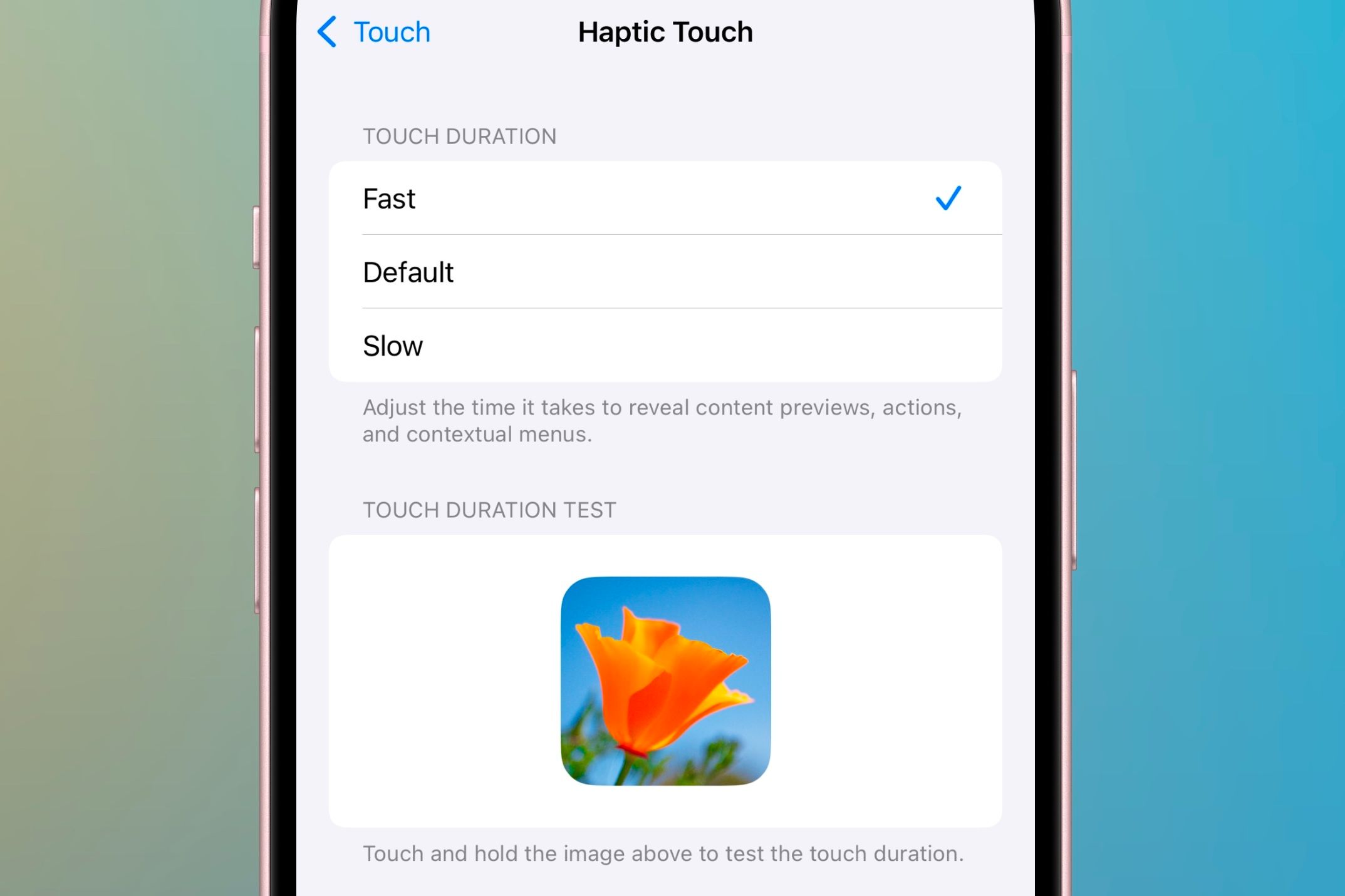
On the other hand, if a slider is not feasible, a menu to select the intensity of the effect could be added. This could allow users to choose between different versions of the effect, from beta one, two, and three.
This menu could be optimized like the Haptic Touch section in Settings. It would include three different stages of the effect implemented and a visual beneath the options to see an example of each intensity.
No matter how it’s implemented, incorporating a Liquid Glass intensity slider or selector for how strong the effect appears would be a great addition. It would give you more control over your device's appearance and behavior, based on personal preference.
Liquid Glass forms the future of how Apple’s operating systems will look for years to come. However, given how often Apple has changed the design, it’s unclear what the final form of Liquid Glass will look like when the official version is released in the fall.
Adding a slider to choose the intensity of the Liquid Glass effect gives you the choice of how clear or frosted you want the design to be. It allows the visuals to adapt more to your needs than for you to adjust, opting to respect both design and accessibility.
Fortunately, we are still in the early stages of the OS 26 betas, so there is still plenty of time for Apple to change the design. However, only time will tell how Liquid Glass will be displayed—whether by how it looks in beta one, three, or in a different form in a future beta.